UX Process Improvement / Lean Methodology
StarTrack
Manual Sort Workflow Redesign
Role: UX Designer (Process & Experience Focused)
Project Type: Internal Workflow Optimisation
Tools: Observation, Data Analysis, Signage Design, Miro, Canva
Timeline: 4 weeks
Team: Collaboration with Shift Manager, Area Supervisor, IT Analyst
Overview
The warehouse’s automated sortation system frequently rejected freight due to unreadable labels, particularly caused by poor induction practices during unloading. This increased delays, rework, and the likelihood of late customer deliveries.
Goal
The goal of this project was to reduce reject lane freight caused by unreadable labels by improving the unloading process. This involved designing clearer onboarding materials, enhancing visual reminders, and streamlining signage to support correct label placement.
Problem Statement
New and existing unload staff struggle to consistently induct cartons with labels facing up, resulting in high reject rates and rework, ultimately delaying customer deliveries.
How Might We
- How might we improve label-facing compliance during induction?
- How might we help new staff retain critical instructions?
- How might we visually reinforce correct unloading behaviours?
User Research
User Groups:
- Unload Freight Handlers (often new agency staff)
- Reject Lane Team Members
- Team Leaders and Supervisors
Research Activities:
- Informal interviews with team leads about pain points
- Observation of unload processes during both AM and PM shifts
- Review of historical reject lane data with IT Analyst
Key Insights:
- Majority of rejects were due to “No Read” errors from labels facing down
- New staff weren’t retaining training info due to overload
- Signage was outdated, unclear, or ignored
Root Cause Analysis
To identify the root causes of excessive reject freight, a Fishbone Diagram was used focusing on the “No Read” issue. Key contributing categories included:
- People (lack of training for agency staff)
- Process (inconsistent onboarding)
- Environment (poor visibility of correct unloading methods)
- Materials (freight label placement inconsistencies)
This analysis was conducted collaboratively with the Lean team. Team members voted using a star system (visible on the Fishbone visual below) to identify which root causes were most critical to address. This approach helped prioritise solutions with the most impact.
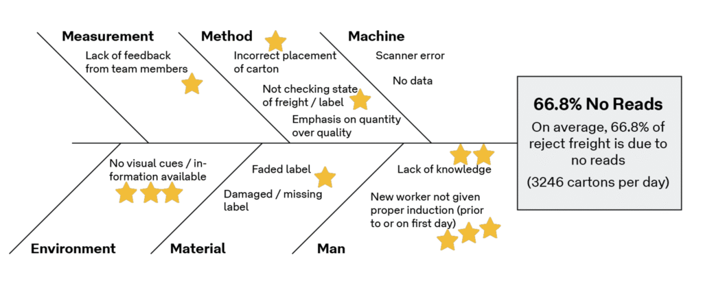
5 Why’s:
- Labels were facing down when inducted
- Staff were unaware of label placement requirements
- First-day induction was rushed and overwhelming
- Induction lacked focus on key task-specific instructions
- No visual reminders were present in the unloading area
These insights directly informed the ideation phase.
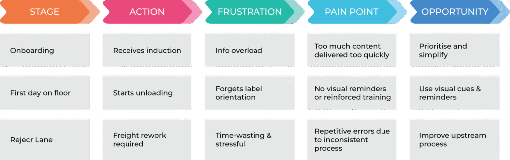
User Journey Mapping
Ideation & Proposed Solutions
Unload Flyer:
- Simple, visual flyer for new and agency staff
- Highlighted essential info (e.g., label facing up)
- Distributed on first day and placed in break areas
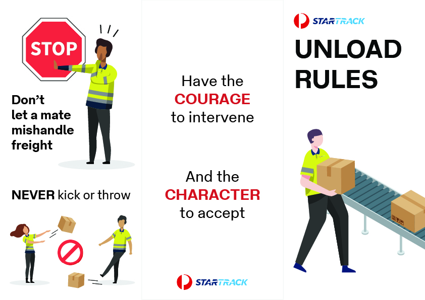
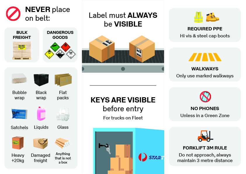
Updated Signage:
- Replaced outdated signs with bold, minimal designs
- Positioned at point-of-action for unloading
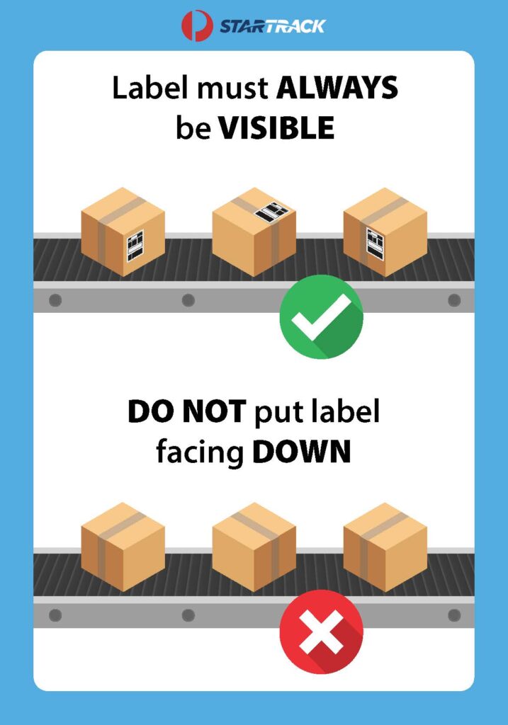
UX Principle Applied: Recognition over recall. Workers shouldn’t have to remember correct procedures — visual cues should reinforce them.
Testing & Feedback
- Conducted go-see walks with Shift Managers to observe changes
- Walked new staff through updated materials
- Weekly data checks with IT Analyst
User Feedback:
- “The new signs are much clearer—we don’t have to guess.”
- “The flyer helped on my first day. I looked at it when I forgot.”
Results & Metrics
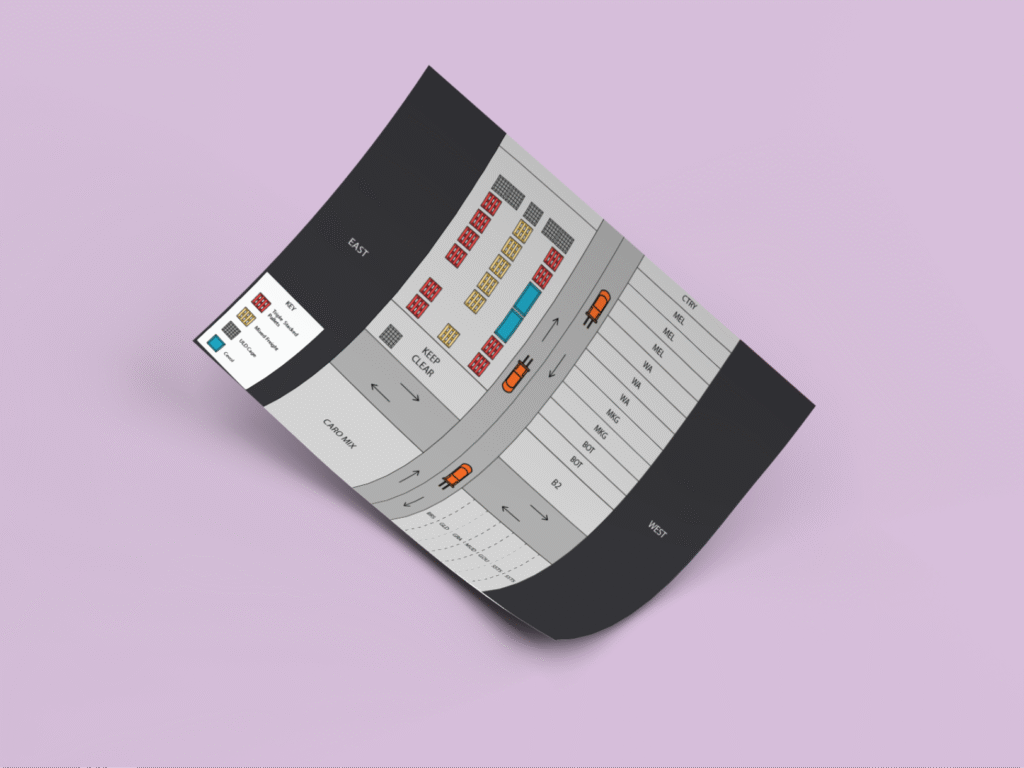
Reject Lane Data Overview
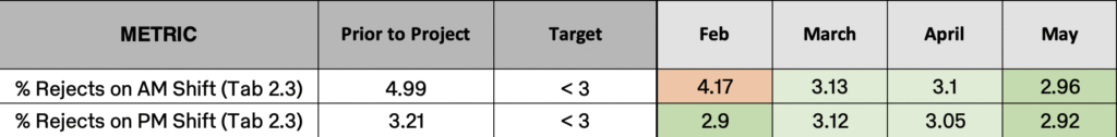
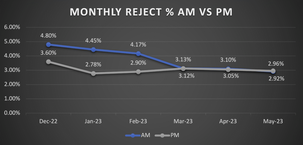
Impact:
- Total reject rates dropped below the 3% target for both shifts
- Visual clarity and simplified onboarding contributed to long-term behavioural change
Reflection & Learnings
What I Learned:
- Behavioural UX is crucial in industrial environments
- Collaborative Lean tools like Fishbone and 5 Why’s help prioritise real user pain points
- Visual design and environmental context are as important as functionality in process UX
Next Steps:
- Create visual bar chart of reject rate change for team comms
- Expand training to other induction points
- Explore signage standardisation across all StarTrack sites