Krystal is a Sydney-based lifestyle photographer specialising in maternity, newborn, and couples photography. She needed a website that would serve as both a portfolio and a streamlined booking system. The aim was to improve user experience, reduce admin burden, and increase client bookings.
Problem
Krystal’s previous method of booking via Instagram DMs led to inconsistent communication, missed opportunities, and time-consuming back-and-forth messaging. Her ideal clients—busy parents—needed a quick and easy way to book a session.
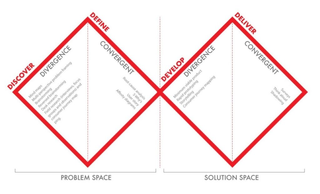
Design Approach
User Research
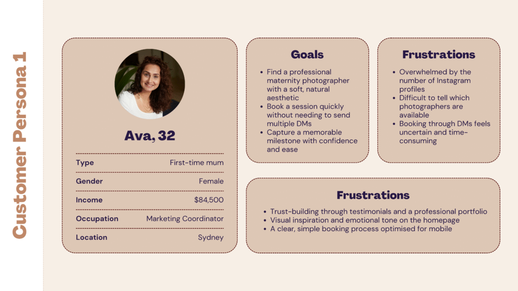
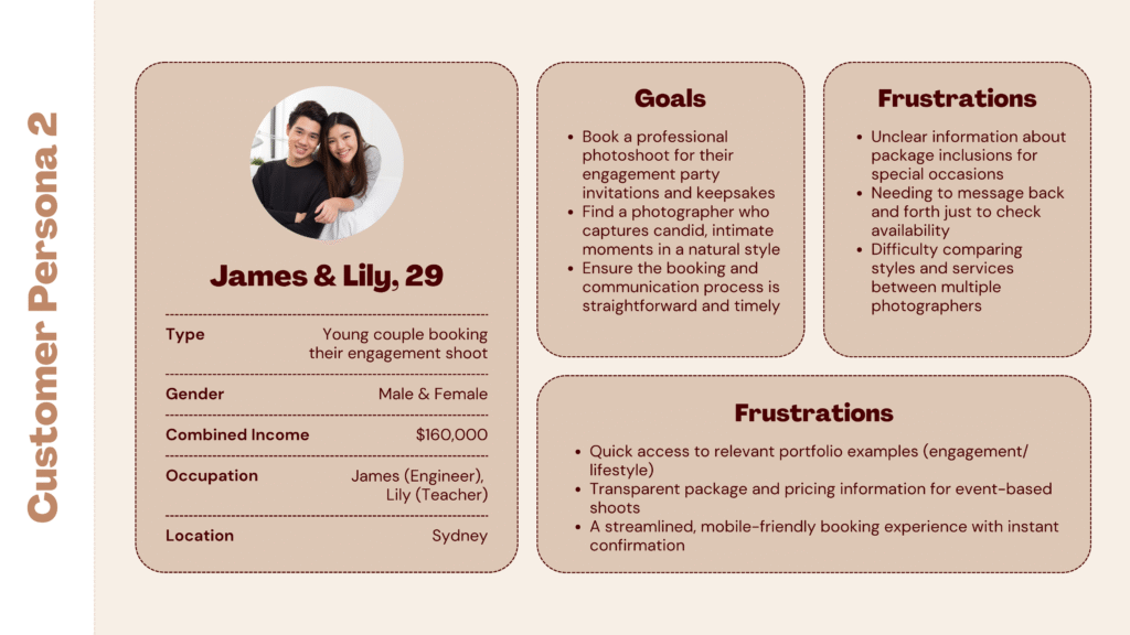
Target Users:
Mums-to-be
Parents of newborns
Couples booking intimate or milestone shoots
Methods:
To better understand user needs and pain points, I conducted informal interviews with three individuals from the target demographic and analysed competitor websites to identify gaps and opportunities. This helped uncover behavioural patterns, preferences, and usability barriers specific to mobile-first experiences.
Insights
Users browse mostly on mobile
Booking needs to be fast and frictionless
Emotional connection to photos influences decision
Personas
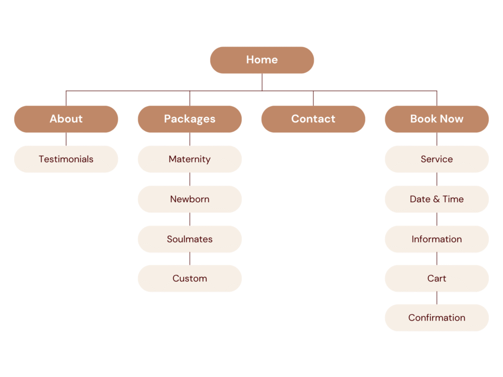
Sitemap & Structure
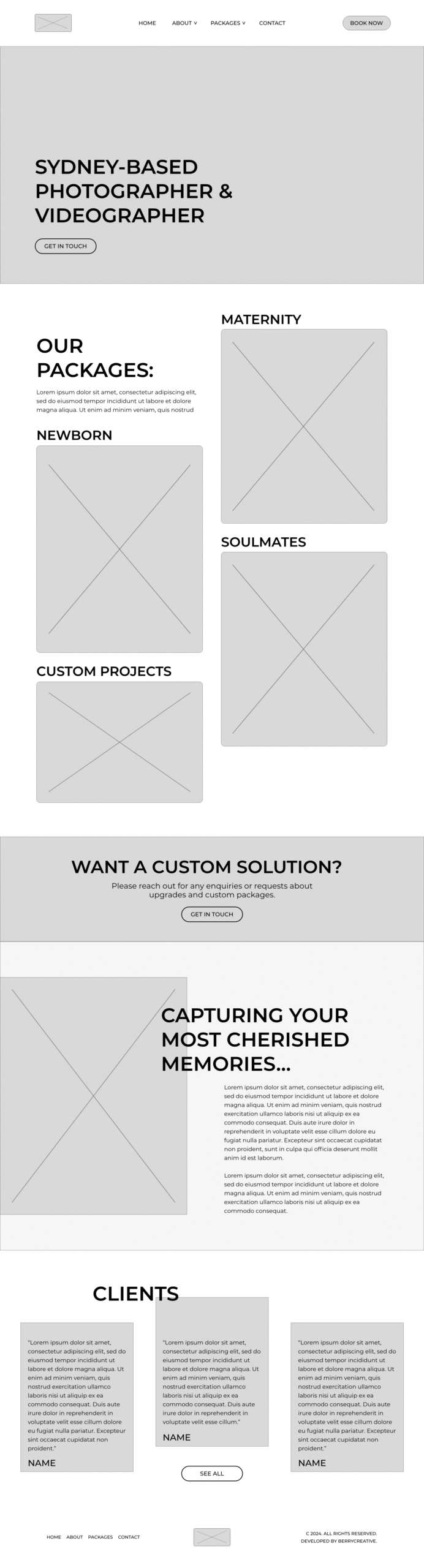
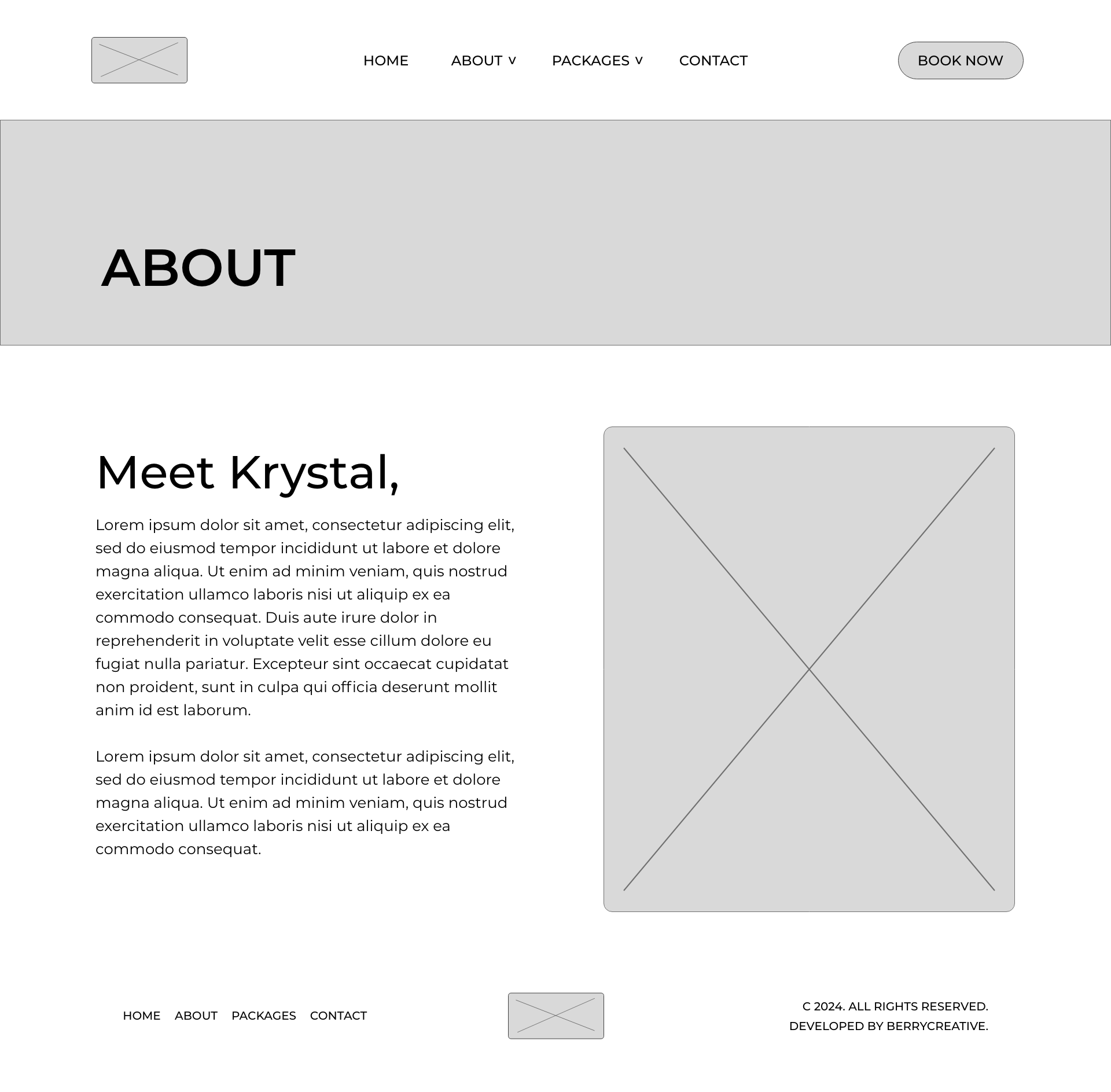
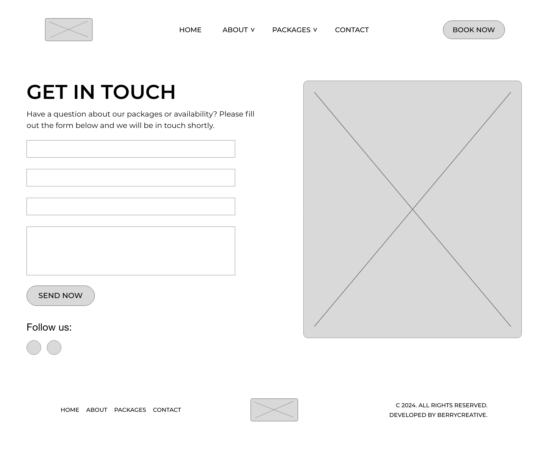
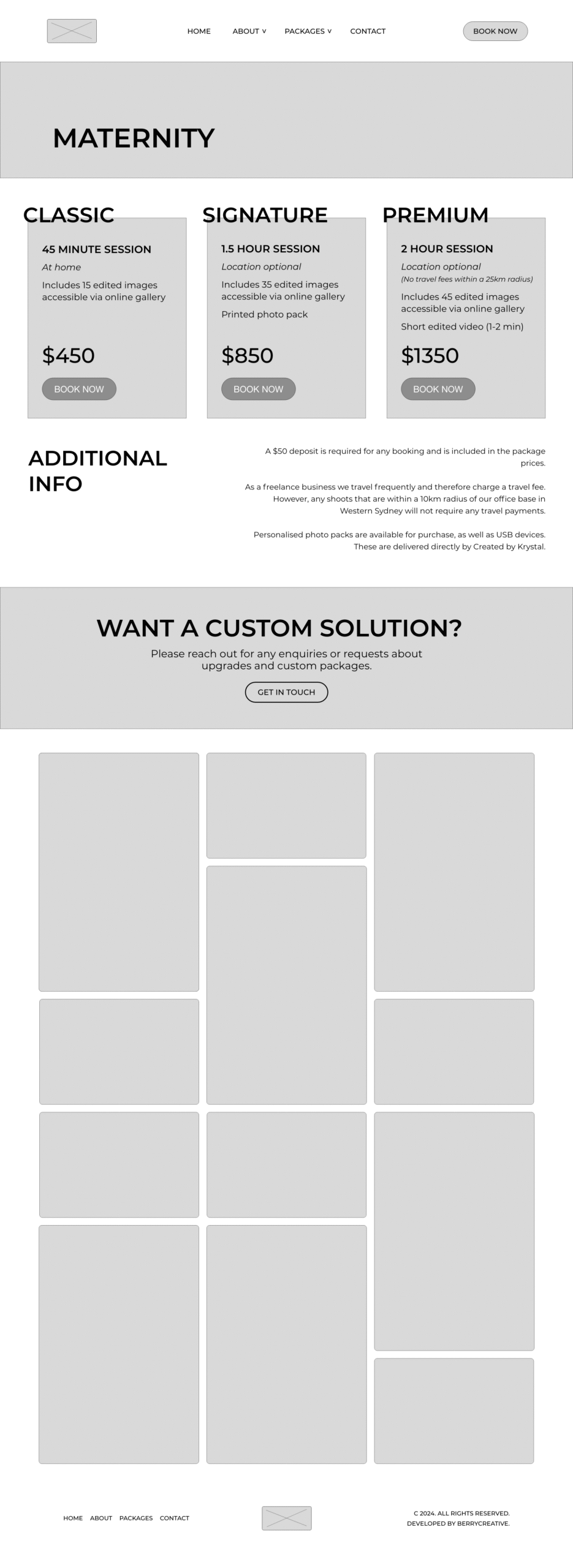
Wireframes
Low-fidelity wireframes were created in Adobe XD to plan the structure and user flow. Key screens included:
Home page with hero message and CTA
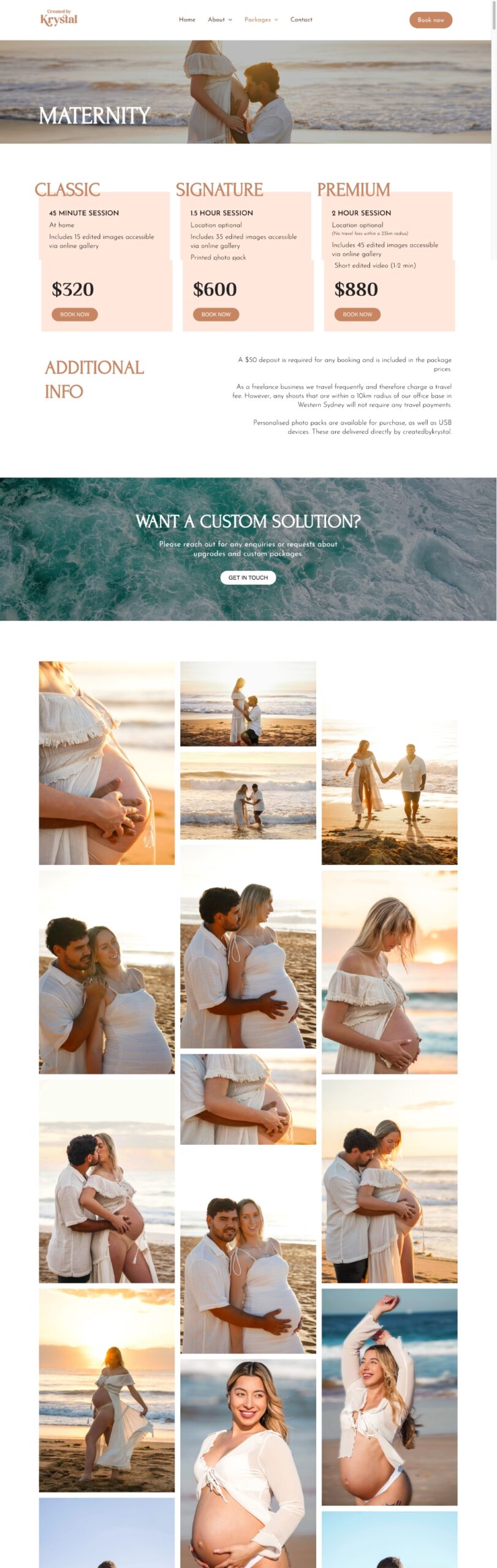
Category-specific gallery pages
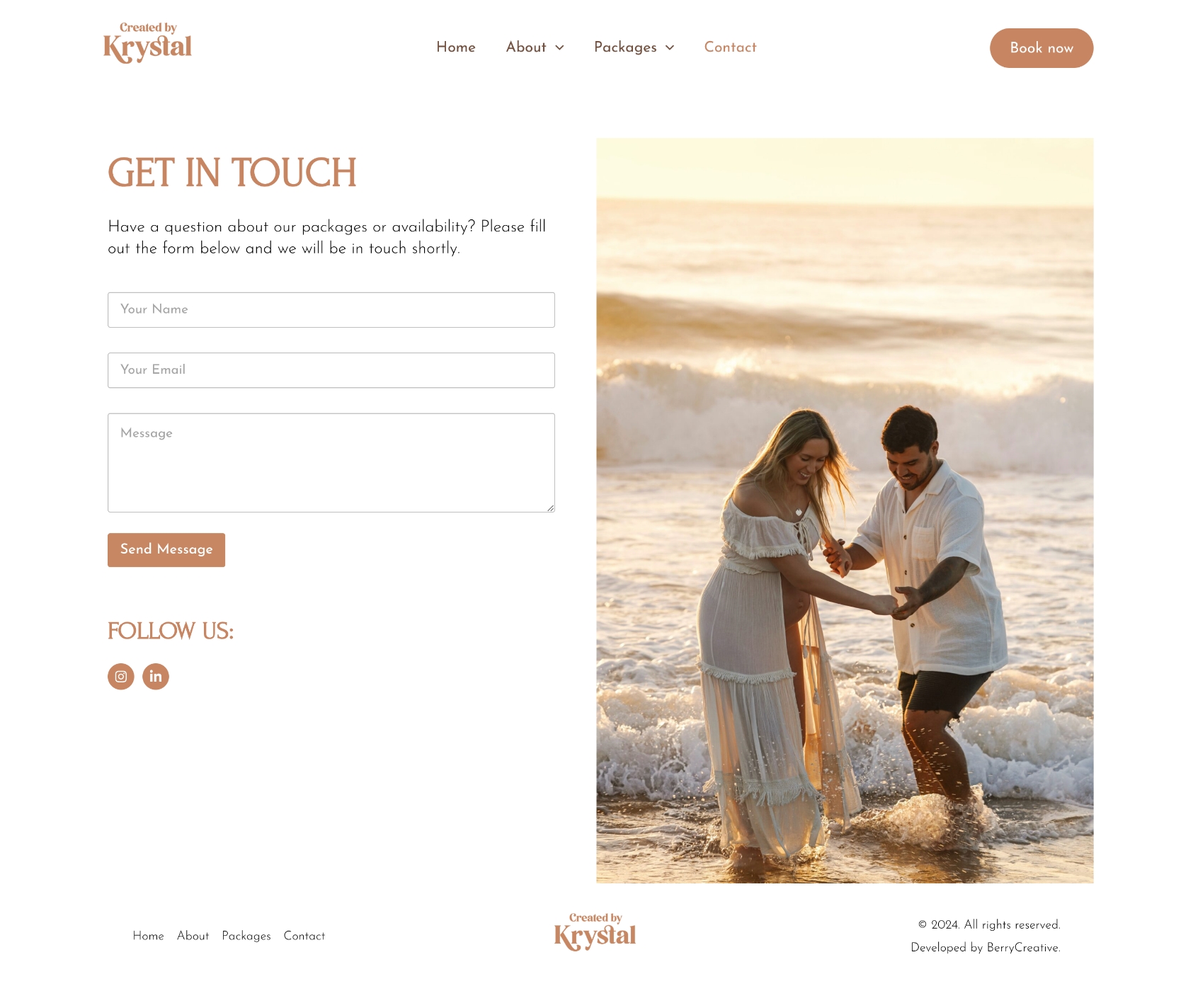
Booking page with date and time selection
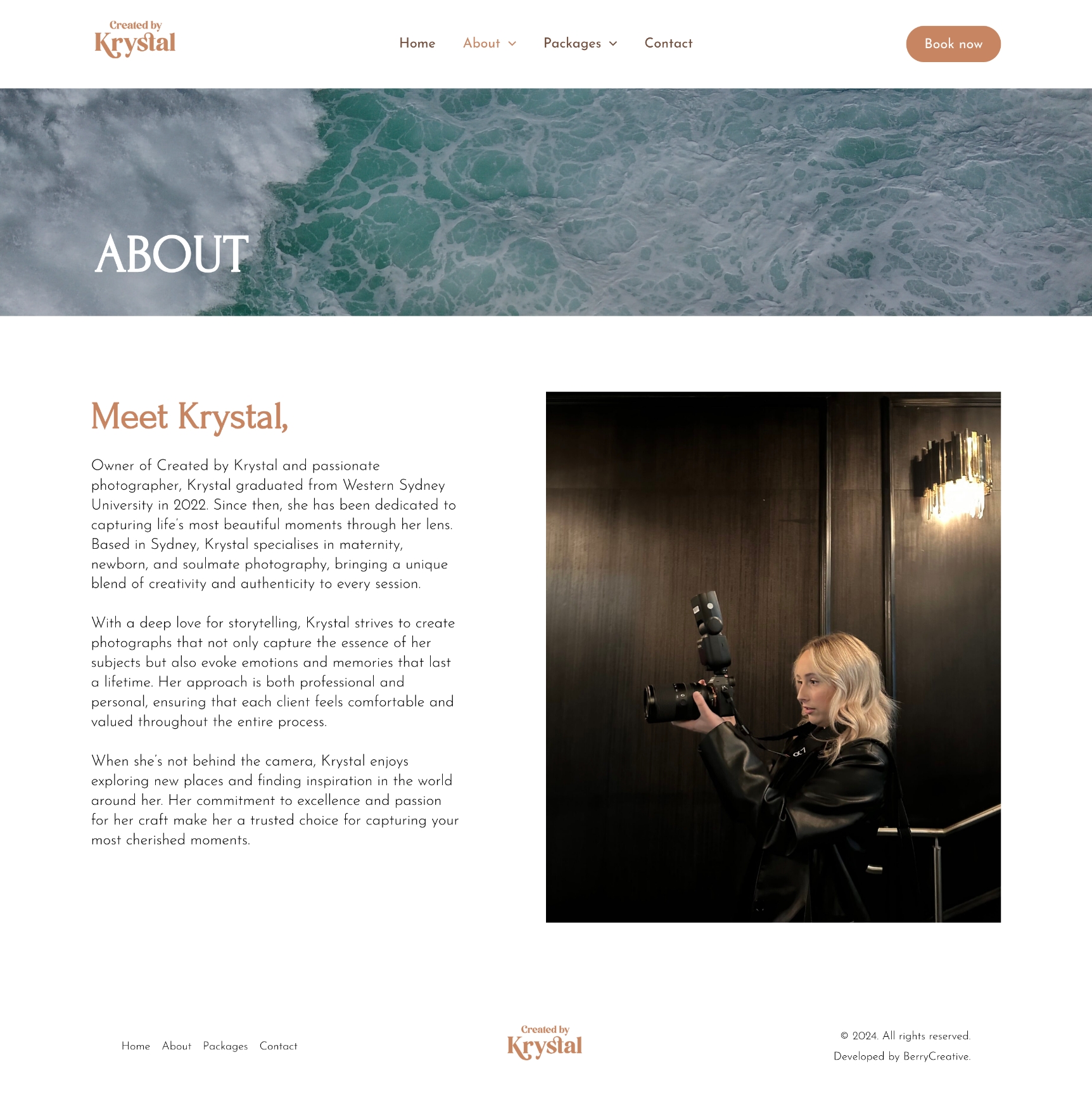
About section for credibility and trust
These wireframes were used as a reference for layout decisions and content prioritisation during development.
Usability Testing & Feedback
A round of informal usability testing was conducted with three target users on laptop devices. Test tasks included:
Navigating to the correct package
Booking a session
Enquiring about a custom solution
Findings & Iterations:
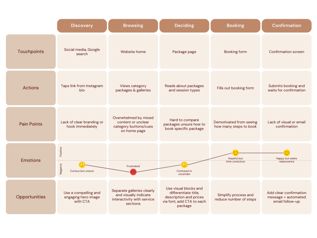
Issue: Users didn’t realise the images under section titles (e.g. “Maternity”) were clickable links to the relevant package page
Change: Introduced subtle hover animations to visually indicate interactivity and improve click-through behaviour
Issue: Users were overlooking the booking call-to-action on category pages
Change: Redesigned each package as a visually distinct card with a prominent “Book Now” button to improve visibility and usability
Issue: Users were unsure how to enquire about a custom photography session
Change: Added a consistent banner across the Home and Package pages with the message “Want a Custom Solution?” and a clear CTA linking to the contact form
User Journey Mapping
Visual Design
Style: Soft, warm, professional
Palette: Neutral & warm tones
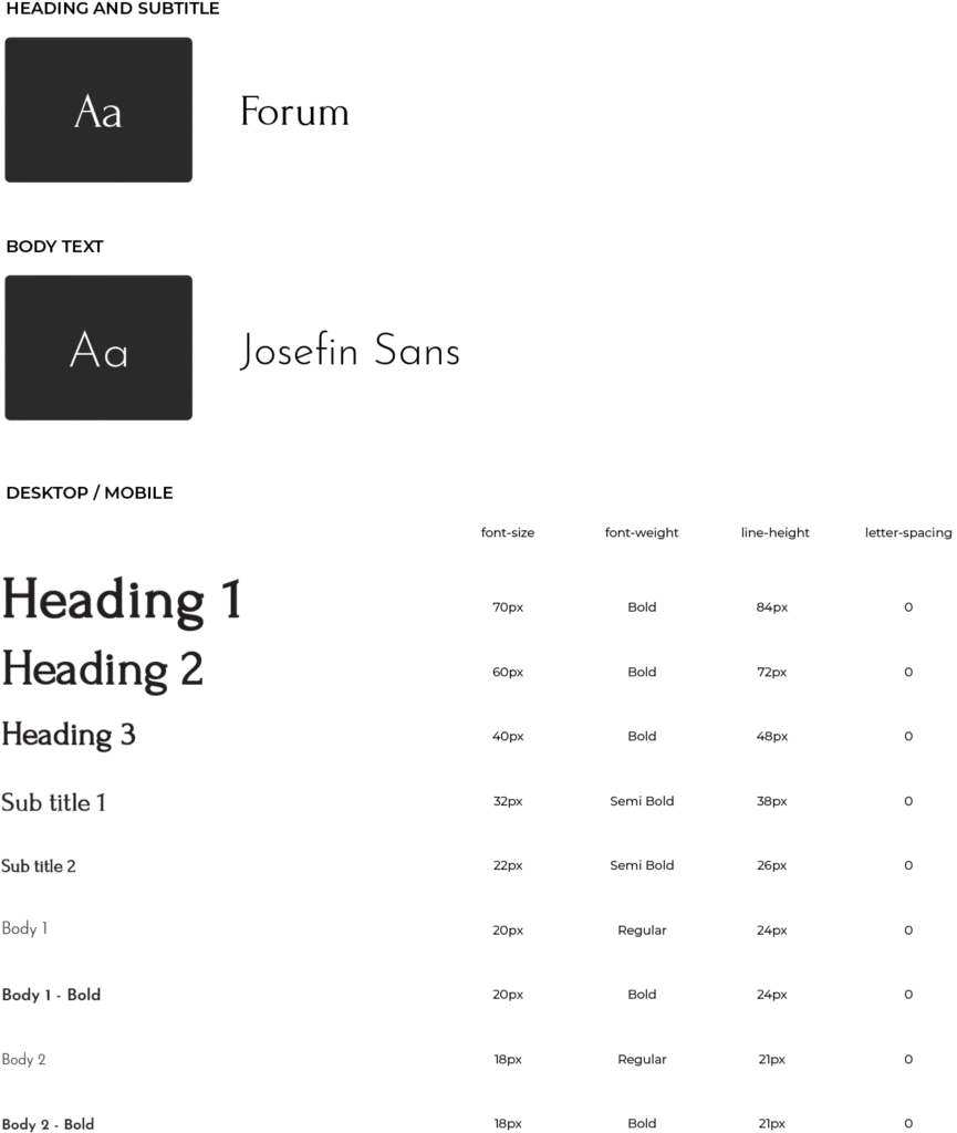
Typography: Elegant serif for headings, modern sans-serif for body text
Imagery: Full-width immersive visuals
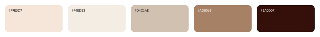
Color Palette
Colours used in the design for text, buttons or background colours.
Typography
Fonts selected for headings, body text, and accents to establish hierarchy and maintain a consistent brand style.
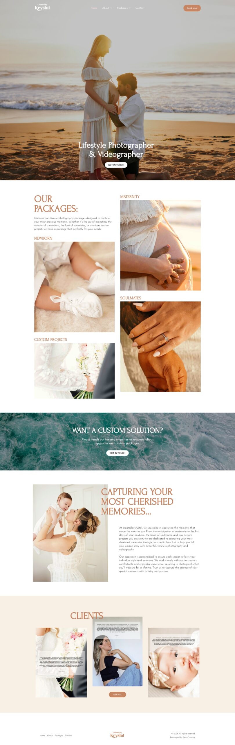
High Fidelity
The high-fidelity design elevated Krystal’s photography brand with soft tones, clean typography, and a neutral palette. Immersive imagery highlights the authenticity of her maternity, newborn, and couples photography, resulting in a cohesive and professional site.